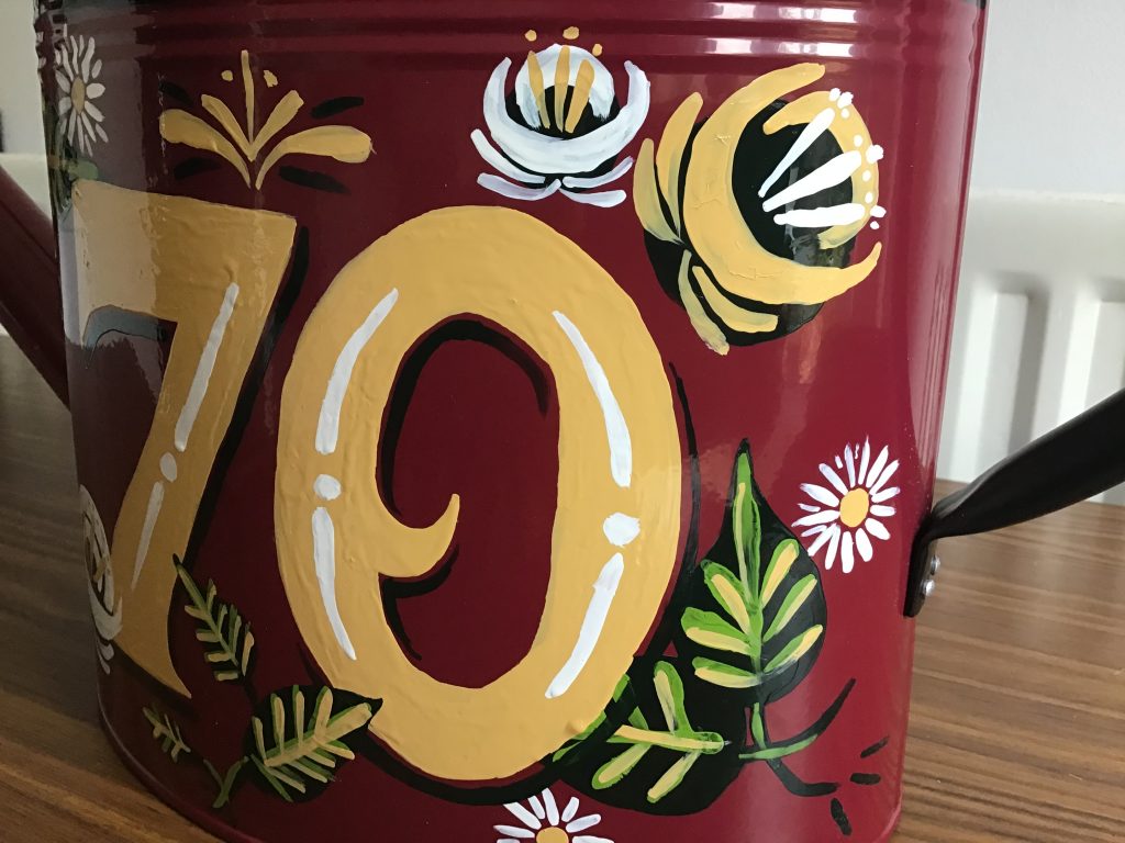
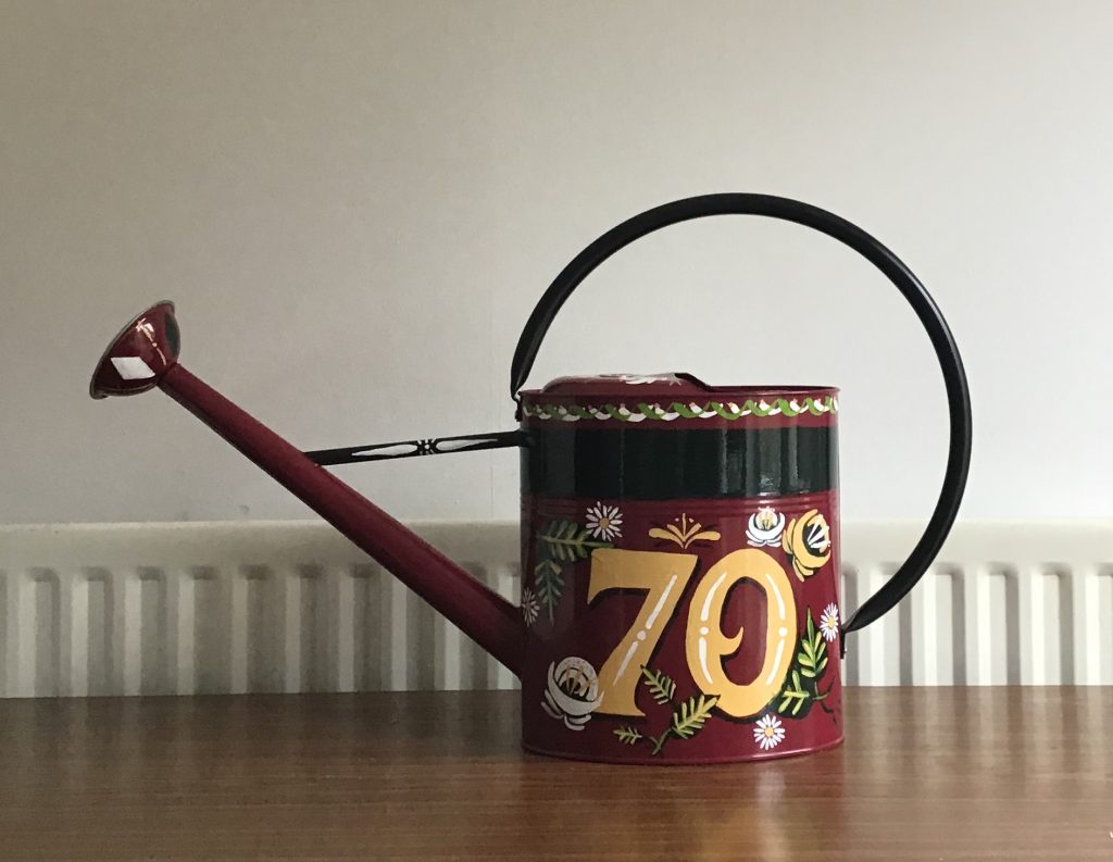
My Nan has had a fascination with canal boats in recent years, she absolutely loves them! If she had the chance or the money, I expect she’d be quite happy living on one. Anytime we catch up we can’t help talking about Great Canal Journeys on channel 4 and the places they’ve been along with any mishaps. So when it came to thinking about what present I should get her for her 70th birthday this year, I thought it would be fitting to create a piece of traditional canal art to celebrate her life. Originally I wanted to commission a traditional sign writer to create something special and see the craft in all it’s glory. But following little planning, I found myself with a week to go until her birthday with little to no signwriting experience.
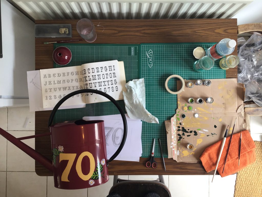
I had high hopes, a few ideas and little know how but I coughed up for everything on next day delivery just to be sure I had everything. Using my iPad I created an initial design to consider colour choices. At the end of the day I wanted to limit my colour palette and only buy the essentials for a good quality finish. I first decided on the medium - a metal watering can which is commonplace on most canal boats and perfect for my Nan who also enjoys gardening. In that case I needed enamel paint, paint thinner and a reasonably priced watering can. Ideally the can would be painted already to save myself a job and add depth to the art. I found a burgundy Molton Mill model for £20 which included next day delivery and got to work on the colours and design.
Having shown an interest in sign painting whilst at university, I had a few books to hand for inspiration and adopting a lettering style. I then used Pinterest to source examples of canal boat art and techniques for painting flowers which proved really beneficial when it came to the day. Whilst painting the letters was really tricky as I had to do everything without guides, I soon improved as time went on at how I controlled the brush and manipulated it’s weight with pressure.
I’m really pleased with how it turned out, if I’m honest I didn’t expect it to turn out quite as well as it did. After making a whole load of mistakes, I was able to adapt the lettering style to suit what I felt at least looked right. Going on to add detail and a shadow to the lettering as well as add depth by placing flowers both in front and behind was a further delight. Thankfully she liked it too.