19 Mar

Peblo 2.0

In my last post, I showed the first iteration of my Peblo animation. In case you missed it, here it is again.

On a basic level, I wanted to create a scene where the main character is caught off guard by a wave and bursts out in a fit of laughter. Before shortly returning back to normal. This is my first story using the character Peblo which I created a few years back. He's been steadily evolving into a more solid idea and style over the last few months in the bid to start creating short animations with him. The illustration was created in Procreate and animated using Adobe After Effects.

In my first iteration, I learnt how to control facial expressions using sub comps and hold frames to switch between different states e.g. blinking, smile changing to open mouth. To mimic how gravity effects your eyes, nose and cheeks when you jump upright - I learnt how to add a delay to a null object. That way when Peblo giggles and starts to move up and down, his features are offset so they move a fraction of a second after his body.

The problems I faced however were:

  • How do I make the water more obvious that it's water.
  • How do I make the scene feel more realistic but not compromise on style too much.
  • Is it clear that Peblo is giggling?
  • Does Peblo move in a natural/smooth way?
  • Is it clear that we're viewing the stone from above on a beach where the waves are crashing onto the shoreline?

This time, I used various effects to help achieve the final outcome. Through some experimentation, I managed to find an effect called "Dissolve melt" which allowed me  to create a layer which looked like water drying on a surface. I used this for Peblo's face, to show he wasn't submerged but sitting just above the top of the water.

I also revisited the background, opting to move away from a minimal detail view to something that felt more familiar with the texture and colour of Peblo. This was so the viewer felt the character was in his natural habitat, and therefore easier to identify.

Just like how if you get close enough up to sand, you start seeing different colour grains and materials, I added further spots of colour to visually convey how close the scene is from the camera. To exaggerate the movement of the water, I added a stick and blue bottle top to the scene - animating them in their own unique way to create depth and realism.

As for Peblo himself, I tweaked the delay of the null objects ever so slightly so the animation felt tight and subtle. To show he was laughing, I disrupted the water by adding ripples and a turbulent displace effect to distort the detail. (I'm now thinking I should also distort the shape of the stones underneath as you would be looking through the water at them)
30 Jan

Peblo animation

I've been messing around in procreate a lot recently on my ipad in the bid to animate a little character called Peblo. Here's a rough animation test I did earlier today using After Effects. I really like the time delay for the facial features so it feels more realistic and charming at the same time.

Still some work to be done in animating the water and movement of Peblo as the water catches him by surprise.

20 Jan

Danny’s old VW golf

7BF1B9C3-3321-4F40-8DA3-10F18E66957A

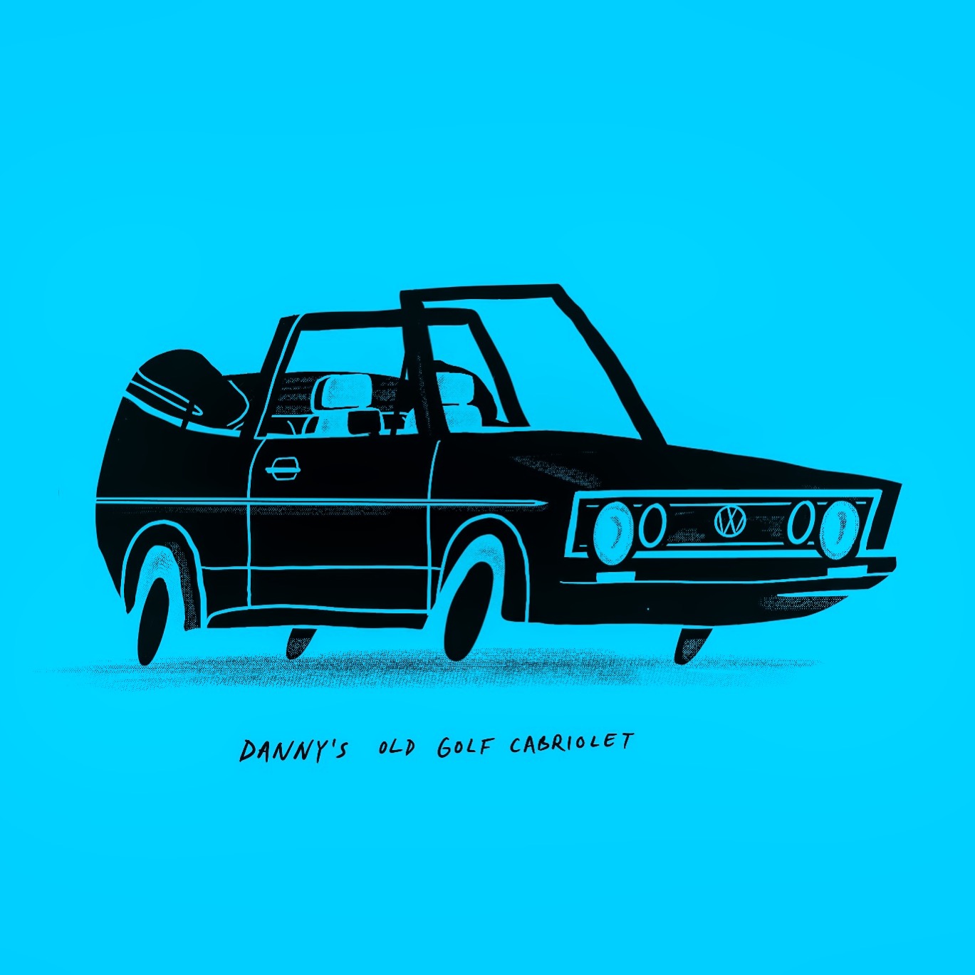
I finally made good use of my half tone brushes in Procreate to illustrate a different classic car. When I was a kid, my uncle owned a Volkswagen Golf cabriolet that he customised by painting sky blue and was his pride of joy. I remember it well most because how could you forget a car in that colour!

4 Dec

BMX Samurai

76F39460-281C-46D0-B9AE-B4CBE949F14D

The other week I painted some lettering on the front of my bmx to freshen the look. I should have waited to do it another time instead of rushing through it. It’s a little bit sloppy and originally I wanted to create a custom sticker design to go there. I’ve toyed with the idea before but wanted to come up with something new to warrant ordering a batch of stickers.

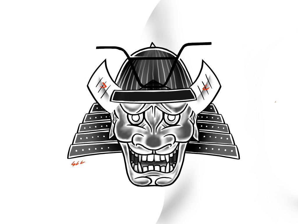
I had a little downtime on Friday and created this samurai using Procreate. I used some reference material to help inform the shapes and shading. I’m thinking now this would be a perfect sticker design to use and share.

21 Aug

Folk art

BECBC2C3-69D4-4B5D-A887-853561D5067C

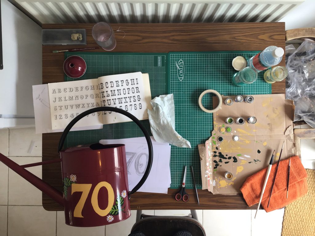
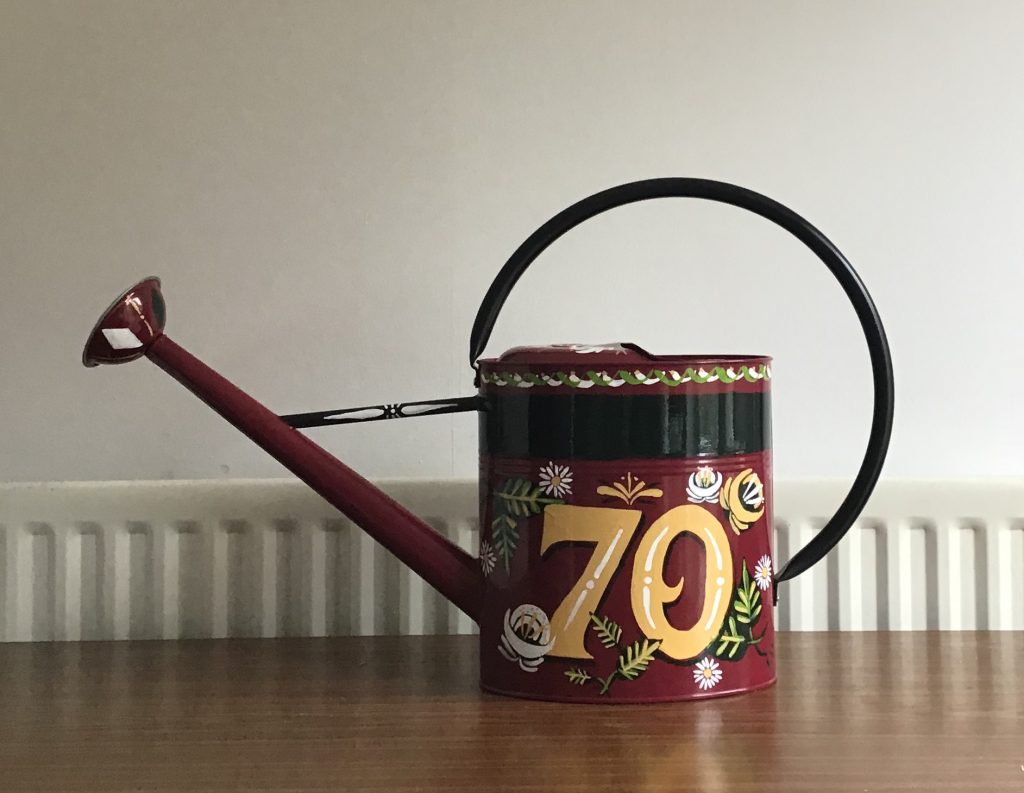
My Nan has had a fascination with canal boats in recent years, she absolutely loves them! If she had the chance or the money, I expect she’d be quite happy living on one. Anytime we catch up we can’t help talking about Great Canal Journeys on channel 4 and the places they’ve been along with any mishaps. So when it came to thinking about what present I should get her for her 70th birthday this year, I thought it would be fitting to create a piece of traditional canal art to celebrate her life. Originally I wanted to commission a traditional sign writer to create something special and see the craft in all it’s glory. But following little planning, I found myself with a week to go until her birthday with little to no signwriting experience.

I had high hopes, a few ideas and little know how but I coughed up for everything on next day delivery just to be sure I had everything. Using my iPad I created an initial design to consider colour choices. At the end of the day I wanted to limit my colour palette and only buy the essentials for a good quality finish. I first decided on the medium - a metal watering can which is commonplace on most canal boats and perfect for my Nan who also enjoys gardening. In that case I needed enamel paint, paint thinner and a reasonably priced watering can. Ideally the can would be painted already to save myself a job and add depth to the art. I found a burgundy Molton Mill model for £20 which included next day delivery and got to work on the colours and design.

DC92EE87-949C-416D-9959-A50986468C96

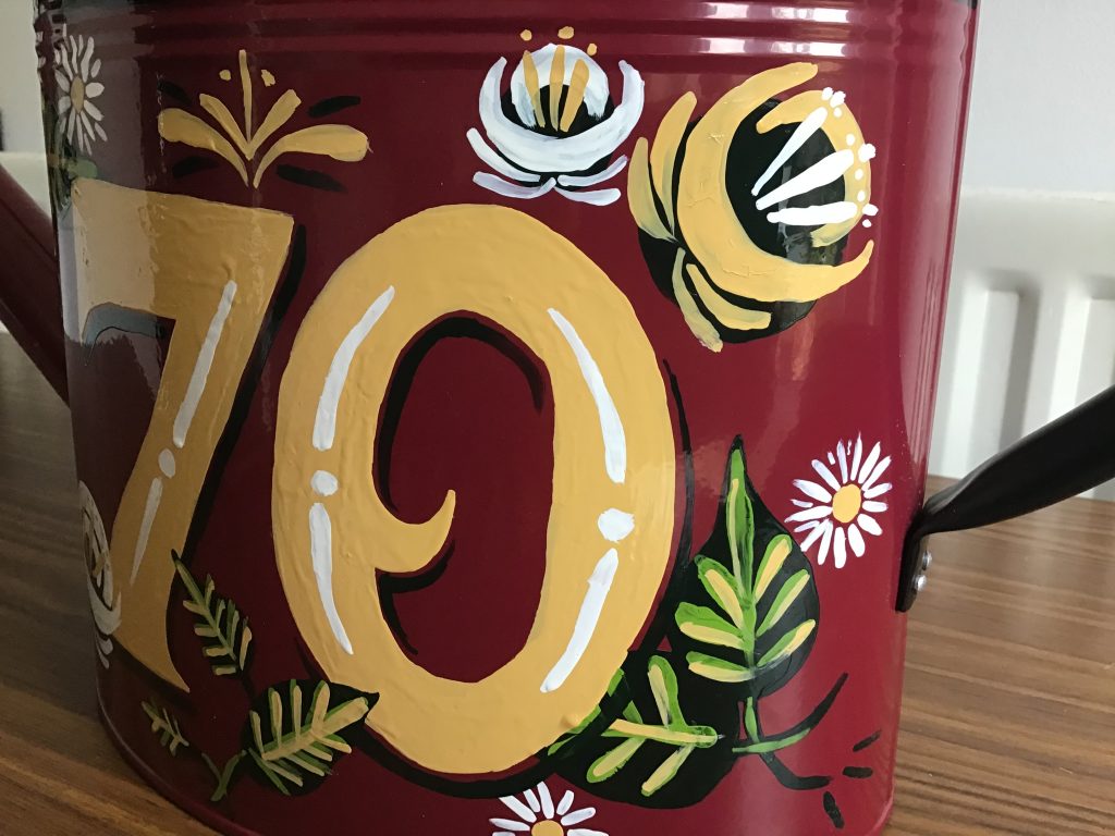
Having shown an interest in sign painting whilst at university, I had a few books to hand for inspiration and adopting a lettering style. I then used Pinterest to source examples of canal boat art and techniques for painting flowers which proved really beneficial when it came to the day. Whilst painting the letters was really tricky as I had to do everything without guides,  I soon improved as time went on at how I controlled the brush and manipulated it’s weight with pressure.

I’m really pleased with how it turned out, if I’m honest I didn’t expect it to turn out quite as well as it did. After making a whole load of mistakes, I was able to adapt the lettering style to suit what I felt at least looked right. Going on to add detail and a shadow to the lettering as well as add depth by placing flowers both in front and behind was a further delight. Thankfully she liked it too.

1604DC28-B3EB-457C-BC9A-38487775C9FC

All work enquiries

hello@samstanistreet.com